Why Do So Many 'Creative' QR Codes Fail to Scan?
A successful scan takes about half a second. A failed one buys you maybe three seconds of the customer's patience before the phone goes back in the pocket and your poster becomes wallpaper. Nobody complains. Nobody emails support. They just leave, and you never find out.
Here's the scene behind most of these failures. A designer gets the brand guidelines: forest green primary, burgundy secondary, dark backgrounds everywhere. The QR code gets styled to match — white modules on the green, maybe a gradient for polish. It looks great on a calibrated monitor. It passes the informal office test, which is one person scanning it once, on a new iPhone, at a desk, under good lighting. Fifteen thousand brochures go to print. At the trade show, half the phones that try the code get nothing at all.
The reprint costs more than the design did. But the print bill isn't the worst part. The worst part is that QR failures are silent. Your analytics count successful scans; there is no dashboard for the people who gave up. From your side of the numbers, a dead code and an unpopular campaign look identical.
The root cause is almost always the same misunderstanding. A QR code is not a small picture of your brand. It's a machine-readable data format that happens to be visible to humans. Designers quite reasonably optimize it for the human eye — harmony, palette, mood. But the first "reader" of your code is never a human. It's a camera sensor and a decoding algorithm that care about exactly one thing: unambiguous differences between light and dark. Everything else — hue, saturation, tastefulness — is noise to them.
The good news is that brand expression and reliability aren't enemies. You can have a colored, good-looking code that scans every time, on every device, in a dim bar and in direct sun. You just need to know the handful of rules the scanner is enforcing, because it enforces them without mercy or negotiation. That's what this guide gives you: the technical reason behind each rule, the thresholds that matter, and a pre-print checklist you can run through in five minutes before anything goes to the printer.
How a Scanner Actually 'Sees' Your QR Code
Your eyes are terrible equipment for judging a QR code, because your eyes and a scanner are doing completely different jobs. When you look at your design, you see crimson and forest green as obviously different. A scanner never sees color at all. The first thing it does with the camera image is throw the hue away.
The decoding pipeline looks roughly like this:
- Grayscale conversion. The image is flattened to brightness values. Crimson and forest green, which looked so different to you, can collapse into nearly the same shade of gray. If your color choice was relying on hue to separate foreground from background, it just lost its argument.
- Thresholding (binarization). The scanner picks a brightness cutoff and sorts every pixel into black or white. If your foreground and background are close in brightness, that cutoff becomes a coin flip, and modules start landing on the wrong side of it.
- Finding the symbol. The detector sweeps rows and columns looking for a specific signature: runs of dark and light pixels in the proportion 1:1:3:1:1. That's the fingerprint of a finder pattern — the three large bullseye squares in the corners. Find three of them, and the scanner knows where the code is, how big it is, and how it's rotated.
- Locking the grid. The timing pattern — an alternating dark-light strip running between the finder patterns — tells the scanner how many modules wide the grid is. Alignment patterns (the small bullseyes on larger codes) let it correct for perspective and curvature, like a code printed on a coffee cup.
- Sampling and decoding. Only now does the scanner sample the center of each module, read the format information, and run the data through Reed-Solomon error correction to reconstruct your URL.
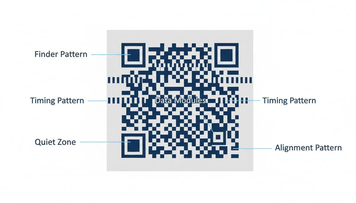
Two parts of this anatomy matter more than everything else combined. The finder patterns, because everything depends on them: if the scanner can't identify those three squares instantly, steps four and five never happen. And the quiet zone — the empty light border, at least four modules wide on every side by specification — because it's what lets the scanner find the symbol's edges at all. Text, a decorative border, or a slice of background photo creeping into the quiet zone is one of the most reliable ways to kill a code, and it happens constantly because to a designer that empty margin looks like wasted space.
Here's the mental model to keep: everything before data sampling is acquisition. If acquisition fails, your error correction never gets consulted and the destination URL is irrelevant. Nearly every color mistake in this article kills the code at the acquisition stage — which is why they're so fatal.
The #1 Mistake: Inverted Colors (Light-on-Dark)
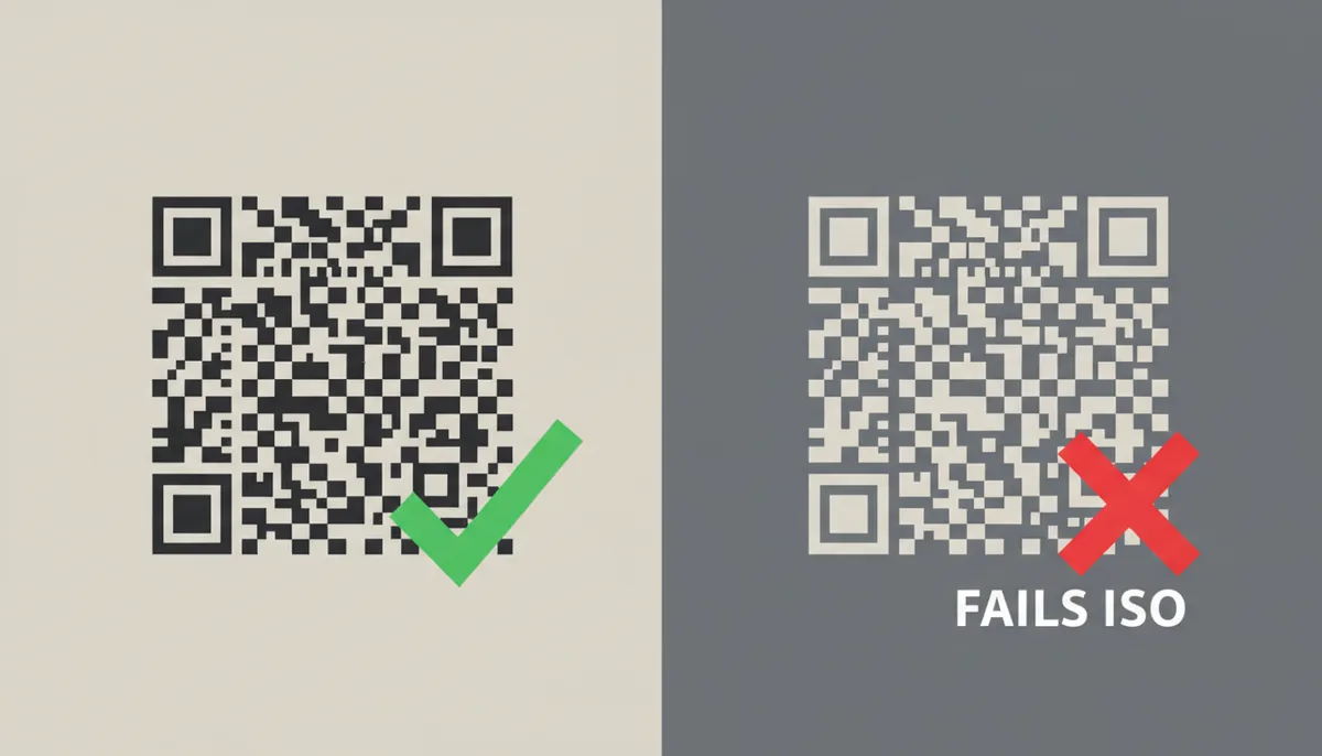
The rule is absolute: a QR code must be dark modules on a light background. Black on white, navy on cream, dark green on pale yellow — fine. White on black, cream on navy, light anything on dark anything — no. A light-on-dark QR code (an inverted QR code) is the single most common cause of total scan failure, and it's also the most common "creative" choice, because dark, moody brand palettes practically demand it.
The reason isn't tradition, it's the detection math. The ISO/IEC 18004 standard — the spec behind the QR Code Model 2 symbols everyone actually uses — defines the symbol as dark modules carrying the data against a light field. The finder-pattern detector is searching for that 1:1:3:1:1 signature in dark-light-dark-light-dark order. An inverted code presents the mirror image: light-dark-light-dark-light. A standard-conforming detector sweeps right past it. There's nothing to find.
This made perfect sense in 1994, when Denso Wave developed the format for tracking parts through manufacturing. It had to read fast, on cheap sensors, in greasy industrial light. Baking in a single polarity made detection simple and quick, and simplicity is why QR codes beat every competing 2D symbol of the era.
Now the objection you're forming, because it's a good one: "I tested an inverted code on my phone and it worked." True — sometimes. Apple's native camera app and Google's scanning pipeline both try inverted polarity as a computational fallback. Your phone has a powerful processor and time to spare, so it flips the image and attempts a second pass. That fallback is a courtesy, not a standard, and an enormous share of the world's scanners extend no such courtesy:
- Older Android phones and budget devices with leaner decoders.
- Browser-based scanners and in-app webview scanners.
- The check-in tablets at conferences and the handheld imagers — Zebra-style units at checkout counters, ticket gates, warehouse doors.
- Apps built on commercial scanning SDKs like Scandit, configured for standard symbols.
Even when the fallback works, it costs time — an extra processing pass before the code resolves, which reads to the user as "this thing is broken." My position is simple: never ship an inverted code. Not as the main version, not as a variant, not "just for the digital flyer."
If your brand lives on dark backgrounds, use the professional workaround: the light card. Place a standard dark-on-light code inside a white or near-white panel with generous internal padding, and set that panel into your dark artwork. The dark design flows right up to the panel's edge, the code stays fully standard, and the contrast between panel and background actually makes the code pop off the design. Every major brand doing QR at scale uses some version of this trick.
The Golden Rule: Your Contrast Ratio Must Be High Enough
Once polarity is right, everything else comes down to one measurable quantity: contrast ratio — the difference in luminance (perceived brightness) between your foreground and background colors, expressed as a ratio from 1:1 (identical) to 21:1 (black on white).
A confession first, because precision matters here: the QR specification itself frames contrast in terms of reflectance and print-quality grades, not friendly hex-code math. There is no line in ISO/IEC 18004 that says "your web designer's color pair must score X." Formal QR code accessibility guidelines as a single document don't really exist. So practitioners borrow the best available yardstick: the WCAG (Web Content Accessibility Guidelines) contrast formula, written for text on screens but perfectly serviceable for any two solid colors.
Here's how to use it:
- Get the exact hex codes for your foreground and background — from the brand guidelines or your design file, not eyeballed.
- Open any free WCAG contrast checker (search "WCAG contrast checker"; there are dozens) and paste in both hex codes.
- Read the ratio. Then apply these thresholds, which are stricter than WCAG's text guidance on purpose:
- 7:1 or higher — ship it. This is the target for anything printed.
- 4.5:1 to 7:1 — acceptable for screen-only codes shown on bright, controlled displays. Not for print.
- Below 4.5:1 — do not ship. This is a low-contrast QR code waiting for bad lighting to finish it off.
- Write the measured ratio into the design file so the next person doesn't re-litigate it.
Why demand 7:1 when 4.5:1 is WCAG's AA threshold for body text? Because a QR code in the wild faces a tax that screen text never does: glare on laminated posters, dim restaurant lighting, a three-year-old phone with a smudged lens and a mediocre camera, direct sun washing out the display the user is looking at while scanning yours. Your contrast margin is what absorbs reality. A code at exactly 4.5:1 in your design tool is a code at effectively 3:1 on a scuffed laminate table tent in a dark bar.
One subtlety that catches people out: the ratio formula is symmetric. White on black scores a perfect 21:1 — and still fails, because polarity is a separate rule (see the previous section). High contrast is necessary, but it is not sufficient.
| Foreground | Background | Contrast Ratio | Scan Reliability |
|---|---|---|---|
| Black #000000 | White #FFFFFF | 21:1 | Excellent — the benchmark |
| Navy #003366 | White #FFFFFF | 12.6:1 | Excellent |
| Charcoal #333333 | Yellow #FFCC00 | 8.4:1 | Good — tested, ships fine |
| Medium Gray #777777 | Light Gray #DDDDDD | 3.3:1 | Risky — fails in poor light |
| Red #CC0000 | Green #009900 | 1.6:1 | Will fail |
| White #FFFFFF | Black #000000 | 21:1 | Will fail — inverted polarity |
Read the last row again until it stops being surprising: perfect numerical contrast, guaranteed failure. And read the red-on-green row until it stops being surprising too — two colors that look like bold opposites to you are nearly twins in grayscale.
One print-specific trap before we move on: colors shift when RGB artwork converts to CMYK for the press. A vivid screen blue can print duller; a delicate pastel can darken or turn muddy. Ask your printer for the CMYK build of your chosen colors, check that pair's contrast as well, and always proof physically on the actual stock. Screens are backlit; paper isn't.
Choosing Safe Palettes: Beyond Black and White
Black on white is the benchmark, not the law. Dark color on light color is a wide, safe space — you just enter it with a ruler, not a vibe.
The background rule: solid, uniform, light. White is best because it maximizes reflectance and makes the quiet zone unambiguous. Very light tints — cream, pale gray, faint pastels — are fine if your measured ratio against the foreground still clears 7:1. Never photos, patterns, gradients, or busy stock. If the design insists on colored or textured paper, print a flat white box for the code plus its quiet zone and let the stock show everywhere else.
The foreground rule: one single, solid, dark color across the entire code — finder patterns included. Proven choices:
- Navy #003366 (12.6:1 on white)
- Charcoal #333333 (12.6:1 on white)
- Deep burgundy #6E1423 (about 11.6:1 on white)
- Forest green, dark brown, very dark purple — all fine once measured
Foreground colors that will betray you on a white background: yellow, lime, cyan (about 2.5:1), orange (#F5A623 scores roughly 2:1), gold, light gray, and every pastel. These fail not because they're ugly but because they're bright — their luminance sits too close to white's. Remember the pipeline: hue is decoration, luminance is signal.
The sneakiest failure mode is the equal-luminance trap: two colors that are clearly different hues but nearly identical brightness. Red on green is the famous case (1.6:1), but blue on purple and teal on navy do it too. Your designer's eye separates them instantly; the scanner's grayscale conversion merges them. The five-second gut-check: convert the design to grayscale, or just squint at it until the colors blur. If the code's structure dissolves, so will the scan.
So how do you color a QR code in practice? The workflow that keeps you safe:
- Lock the background first. One solid, light color — white if you can, a very light tint if the brand insists. Nothing behind the code but that flat color.
- Pick one dark foreground color and apply it to every module, finder patterns included. No multi-color codes, no light accent modules.
- Measure the pair. Run the exact hex codes through a WCAG contrast checker. At 7:1 or higher, the palette ships. Below that, darken the foreground or lighten the background — those are the only two levers.
- Check it in grayscale. Convert the layout, or squint. If the code's structure blurs into the background, the hues were doing work the scanner can't see.
- Protect the quiet zone. At least four modules of plain background color on all four sides — no text, borders, or artwork intruding.
- Reject the shortcuts. No gradients, no transparency over imagery, no patterned fills, however good the mockup looks on your monitor.
Six checks, two minutes, and the palette decision stops being a gamble.
Why Your iPhone Is the Worst Tester You Have
The code flashed and resolved in half a second on the designer's desk. They approved the file. Two thousand table tents went to press. By Thursday, the support inbox held a dozen versions of the same sentence: "The QR code doesn't work."
Here's the mechanism behind that false confidence. Modern smartphone cameras — especially iPhones and flagship Androids — don't feed raw sensor data to the decoder. They run a computational photography pipeline first. Multi-frame HDR evens out shadows and highlights. Local tone mapping boosts edge contrast. Then the QR decoder receives a processed, optimized image that's far more readable than what the camera actually saw. Your phone isn't testing your code; it's fixing your code.
The rescue happens during binarization. A standard scanner converts the image to black and white using either a global threshold — one cutoff for the entire frame — or an adaptive threshold that varies by region. Cheap dedicated scanners and many embedded devices still use global thresholding because it's fast and deterministic. Modern phone cameras use aggressive adaptive methods that analyze neighborhoods of pixels and set local cutoffs. If one corner of your code is slightly washed out, the phone compensates. A dedicated warehouse scanner doesn't.
Third-party scanner apps deepen the variance. Google's ML Kit and Apple's native Vision framework include QR shortcuts that preprocess the image heavily. A bare-bones scanner app from a solo developer often uses the raw camera frame. If your code only scans in the native iOS camera app, you've designed for a specific software patch, not a universal standard.
Zebra Technologies and Honeywell handheld imagers — the hardware used in retail, logistics, and event check-ins — prioritize speed and standard conformity over rescue algorithms. They illuminate the code with a sharp red or white LED that can bleach light colors, and they process the reflection with a comparatively simple pipeline. If your color choice depends on adaptive smarts to survive, it dies on hardware like this.
Treat your newest phone as the worst possible tester. Build your validation stack like this:
- Find the oldest phone in the building that still turns on. Two generations back is better than current. If the code doesn't snap instantly there, redesign.
- Test under bad light. Turn off the overheads and use a single 40-watt-equivalent bulb at arm's length. Modern phones boost ISO and digitally sharpen in dim conditions, hiding low-contrast weaknesses. If the decode slows down, your margin is gone.
- Download a bare-bones third-party scanner app — one that doesn't advertise ML or AI features. These often skip the OS-level enhancement layer. If this app stutters, your code is too fragile.
- If you have access to a handheld 2D imager, test with it. These devices use global or lightly adaptive thresholding and won't forgive gradients, soft edges, or marginal contrast.
Rigorous testing costs an hour. Learning about failure from customer complaints costs trust and print budget.
How File Formats Eat Perfect Colors
You ran the hex codes through a contrast checker. The ratio came back at 8:1. Then you exported the code as a PNG, dropped it into your poster layout, scaled it to fill the box, and sent the file to the printer. On press, the same colors failed.
The disconnect is in the file format. A PNG is a raster image — a grid of pixels. When you enlarge or shrink a raster image in InDesign, Illustrator, or PowerPoint, the software resamples it. Bicubic interpolation averages adjacent pixels to smooth the stair-step edges. A hard black module sprouts a gray fringe. A clean white quiet zone softens into a haze. Those gray intermediates aren't dark or light; they're ambiguity, and ambiguity is exactly what binarization can't process.
Here's the pipeline failure in slow motion. The scanner looks for that 1:1:3:1:1 ratio in the finder pattern. Anti-aliasing blurs the boundary between module and background, so the ratio of dark pixels to light pixels drifts. The detector walks past the symbol without recognizing it. Your colors didn't change; the geometry of their expression did.
JPEG makes this worse. The JPEG algorithm was built for photographs — continuous tones where a little blocky noise in a blue sky is invisible. Applied to a QR code, JPEG compression leaves artifacts in flat color fields that look like phantom data modules. Never use JPEG for a QR code, even at maximum quality.
Vector formats — SVG, PDF, and true EPS — store geometry, not pixels. The file contains an instruction to draw a rectangle from these coordinates in this exact color. The printer's raster image processor converts that instruction into dots at the hardware's native resolution. There's no interpolation, no gray fringe, and no scaling limit. The edge stays binary whether the code is an inch wide or ten feet wide.
| Format | What It Stores | Scaling Behavior | Safe For |
|---|---|---|---|
| PNG | Pixel grid with possible transparency | Anti-aliased soft edges when resized | Web at exact display size only |
| JPEG | Lossy compressed pixel grid | Compression artifacts plus resizing blur | Never use for QR codes |
| SVG | Geometric shapes and colors | Infinite scaling with razor edges | Print, large format, responsive web |
| PDF (vector) | Mixed geometry and page layout | Sharp at any output resolution | Press-ready print jobs |
If you must deliver a PNG for a web page or email signature, generate it at the exact pixel dimensions it'll be displayed. Don't let HTML, CSS, or an email client resize it. For any printed piece — business cards, billboards, packaging — download the SVG or PDF from your generator and place it directly in the layout. QR Code Machine exports both formats for exactly this reason.
One final format trap: dropping a white-background PNG onto a colored layer and using a blend mode like Multiply. The white areas disappear into the background, but the anti-aliased gray fringes blend into muddy intermediate tones. The quiet zone is now technically patterned. Generate the code with a transparent background only if you're placing it on a solid, tested, high-contrast color that meets every rule in this guide.
How Paper and Ink Betray Your Screen Colors
The screen proof was perfect. The press proof looked like it had been left in the sun for a week. The navy had gone dusty, the cream background had yellowed, and scans that worked on the monitor now hesitated or failed entirely.
RGB screens emit light. Paper reflects it. The brightest saturated blue your monitor can display — say, #0066FF — may have no equivalent in the CMYK ink set your printer uses. The color conversion engine maps it to the nearest printable color, which is almost always duller and lighter. If your contrast margin was thin, that shift pushes it under the threshold.
Then there's dot gain. Ink spreads as it strikes paper fibers, so every printed dot ends up larger than the file specified — and the spread is worst on absorbent, uncoated stock. Background tints darken. Foreground edges bleed outward into the light modules beside them. The quiet zone, which depends on uniform lightness, turns mottled.
Stock color is the silent killer. Uncoated "white" paper carries cream, gray, or yellow undertones. Natural or recycled stock is worse. Your background color isn't what you chose; it's the paper itself, plus whatever ink you laid on it. Unless you specify a flood white spot ink as an underbase, you're printing your dark modules directly against the stock's natural color. On kraft paper, that means tan modules against a tan background if your foreground was a light or medium tint.
| Stock Type | Risk Level | What Goes Wrong | Required Action |
|---|---|---|---|
| Coated white | Lowest | Colors hold closest to screen values; gloss can glare under direct light | Proof once, and tilt the proof under bright light to check for glare |
| Uncoated white | Moderate | Dot gain darkens tints and softens module edges; stock adds warmth | Use a higher on-screen contrast target and proof on the actual stock |
| Tinted or colored | High | The stock itself becomes your background, shifting every ratio you measured | Spec a flood white underbase behind the code and its full quiet zone |
| Kraft or recycled | Highest | Dark, fibrous surface adds visual noise and destroys background lightness | White underbase is mandatory — never print modules directly on the stock |
The workflow that prevents this is simple but rarely followed. Convert your hex codes to CMYK in your design software immediately — don't wait for the printer to do it. Measure the contrast of the converted values. If you're printing on uncoated stock, treat 10:1 as your on-screen target. To be clear about what that number is: a conservative house rule for this guide, not measured print-loss data. It exists to absorb whatever the press takes from you, and since the loss varies by printer, ink, and stock, a margin is the honest way to plan for it. If the brand demands a colored or textured substrate, specify a solid white flood behind the entire code area including the quiet zone. That white ink gives you a controlled, predictable light background.
Approve a press proof printed on the exact stock with the exact ink. A digital PDF proof or a laser print on bright office paper is a pleasant fiction. The physical proof is the only surface that tells the truth.
A Real Workflow: Brand Colors That Actually Scan
A brand kit lands on your desk. Forest green primary #1B4D3E, warm off-white #F4F1EA, gold accent #C8A97E. The brief says the winter campaign QR code must feel "on brand." Most designers paste the green into the foreground and pray. Here's how to do it without guessing.
Step one: test the obvious pairing. Punch #1B4D3E and #F4F1EA into a WCAG contrast checker. The ratio clears 7:1, but it sits close to the line. For a print campaign on uncoated stock, close to the line is the same as failing.
Step two: darken the foreground without abandoning the palette. Adjust the code foreground to #0F2E26 — a near-black that still reads as green in direct comparison. The contrast jumps to well over 10:1. You keep #1B4D3E for the headline type; the code gets its own functional variant that echoes the palette without obeying it literally.
Step three: harden the background against the stock. Shift from #F4F1EA to #FAF9F7. That removes the warm cream pigment that uncoated paper will amplify into yellow, and it gives you a clean, neutral light field that scanners recognize instantly.
Step four: match the export format to the medium. The campaign needs table tents and a homepage hero. Generate an SVG for the print run, place it in the layout at the final size, and lock the dimensions. Generate a separate PNG at exactly 400 pixels wide for the web hero. Don't scale a single master file in both directions.
Step five: place the logo with discipline. The marketing team wants the gold badge in the center. Set the generator to Error Correction Level H. Draw a square guide: the logo must sit inside the center and stay at least two modules clear of each finder pattern. The logo covers data modules, not structural ones. Decode the generated image in a separate scanner to confirm the Reed-Solomon algorithm can still reconstruct the URL.
Step six: torture-test the physical proof. Print one on the actual uncoated stock. Scan it with a three-year-old Android under a single warm bulb. Scan from eighteen inches, then from twenty-four. If the camera hunts for more than a second, the brand colors are still too fragile. Darken the foreground to pure black and reserve the green for the border or headline.
If the brand team pushes back — "the green is non-negotiable everywhere" — don't argue. Place a standard dark-on-light code inside a clean #FAF9F7 panel and let the forest green frame the card and carry the headline. The code stays ruthlessly standard. The design stays on brand. The customer never knows you compromised, because the scan works on the first try.
This workflow takes fifteen minutes, costs nothing, and prevents a reprint that typically runs to multiples of the original quote once rush fees are included.
Sources
- ISO (International Organization for Standardization) — The claim that the QR code specification (ISO/IEC 18004) defines the symbol as dark modules on a light background, making inverted codes non-compliant.
- W3C Web Content Accessibility Guidelines (WCAG) — The specific contrast ratios (e.g., 4.5:1 and 7:1) used as benchmarks for determining sufficient contrast between foreground and background colors.
- Denso Wave Incorporated — General principles of QR code structure and function, as they are the original inventors of the technology.
- Zebra Technologies — Claims about how enterprise-grade and industrial scanners operate, reinforcing the need for standards compliance over relying on consumer phone camera 'tricks'.