
Most people handle QR code logos in one of two ways, and both are wrong. The first group generates a code with default settings, drops a logo on top, and ships it — quietly breaking scannability for a slice of their audience. The second group has seen one of those broken codes in the wild, sworn off logos forever, and settled for anonymous black-and-white squares on every poster, menu, and business card they print.
Neither extreme is necessary. QR codes were engineered from the start to survive having part of their surface obscured — that resilience is written into the standard itself. You just have to generate the code with that plan in mind instead of treating the logo as an afterthought. What follows is the mechanics that make a logo possible, the exact procedure for adding one, and the testing routine that catches problems before your print run does.
Why a Plain QR Code Is a Missed Opportunity
Picture a table tent in a café. A customer picks up their phone, sees a bare QR code, and hesitates. Where does this go? Who put it here? That hesitation is expensive, because people have been trained — by experience and by headlines — to be suspicious of anonymous codes. QR phishing, sometimes called "quishing," is a real attack pattern: criminals paste sticker codes over legitimate ones on parking meters and restaurant tables. Your unbranded code is visually indistinguishable from one of those stickers.
A logo answers the question "whose link is this?" before anyone commits to the scan. It works like a return address on an envelope — the contents might be identical, but people open the one they recognize. Nobody can honestly promise you a specific percentage lift in scans, because that depends on your audience and placement. What you can say with confidence is that anonymity is a barrier, and removing barriers is the whole game when you're asking someone to point their phone at a mystery square.
There's a second argument that's pure brand math. Your QR code appears on surfaces you already own: packaging, receipts, conference badges, window decals, the back of your business card. That's media space you're paying for in print costs whether you use it or not. A branded QR code turns a utilitarian artifact into a small piece of brand collateral that reinforces who you are at the exact moment someone engages with you.
The cost of all this is trivial: one settings change during generation and ten minutes of testing. For anything customer-facing, shipping a naked code is leaving value on the table.
How a QR Code Can Work With a Hole in It: Understanding Error Correction
QR codes were born on a factory floor. Denso Wave, a Japanese automotive parts supplier, created the format in 1994 to track components through manufacturing — an environment of grease, scratches, torn labels, and half-obscured markings. The format, later standardized as ISO/IEC 18004, had to keep working when damaged. That requirement produced the feature you're about to exploit: built-in redundancy.
Here's the mechanism. When you generate a QR code, your content — a URL, a vCard, a Wi-Fi password — is converted into a sequence of data chunks called codewords. The generator then runs those codewords through a mathematical process called Reed–Solomon error correction, producing additional codewords that describe the original data. It's the same family of math that lets a scratched CD play without skipping. If some codewords come back unreadable, the decoder uses the redundant ones to reconstruct what's missing. Think of it as a damage budget: a fixed share of the code is expendable, and the scanner can rebuild it on the fly.
The QR standard defines four error correction levels, and each one sets the size of that budget:
| Level | Data Redundancy | Max Logo Coverage (Approx.) | Ideal Use Case |
|---|---|---|---|
| L (Low) | ~7% of codewords recoverable | 0% — do not add a logo | Long URLs and vCards where keeping the code small matters |
| M (Medium) | ~15% of codewords recoverable | ~10% — a tiny centered mark at most | General-purpose codes without artwork; the default on many generators |
| Q (Quartile) | ~25% of codewords recoverable | ~20% | Codes carrying a modest central logo |
| H (High) | ~30% of codewords recoverable | 25–30% | Marketing materials with a prominent central logo |
The trade-off is density. More redundancy means more codewords, which means more modules packed into the grid — or a physically larger code to hold them. That's why most generators default to Level M or even L: it keeps codes compact and clean-looking. It's also why a logo slapped onto a default code is such a common failure. A Level M code can afford to lose about 15% of its codewords, and a decent-sized logo eats that entire budget in one bite.
So the rule is simple: a logo is planned damage, so buy a bigger damage budget. Generate at Level Q at minimum, and use Level H for anything customer-facing. This single setting matters more than your logo's size, its placement, or its colors — get it wrong and nothing else in this guide can save you.
One nuance worth understanding: the redundancy percentage is a ceiling for total damage, not a license to cover exactly that much with your logo. Your printed code will face additional abuse — glare, scuffing, ink bleed, a smudged phone camera. The logo plus real life has to fit inside the budget. That's why the table above caps logo coverage a few points below the theoretical maximum, and why staying conservative pays off.
The Anatomy of a QR Code: What You Can and Can't Cover
A QR code looks like random noise, but it's a strict grid of black and white squares called modules. The smallest code, Version 1, is 21×21 modules; each version up adds four modules per side, all the way to Version 40 at 177×177. Some of those modules carry your data. Others are structural — they exist so the scanner can find, orient, and measure the code. Cover the structural ones and no amount of error correction will help, because the scanner never gets far enough to use it.
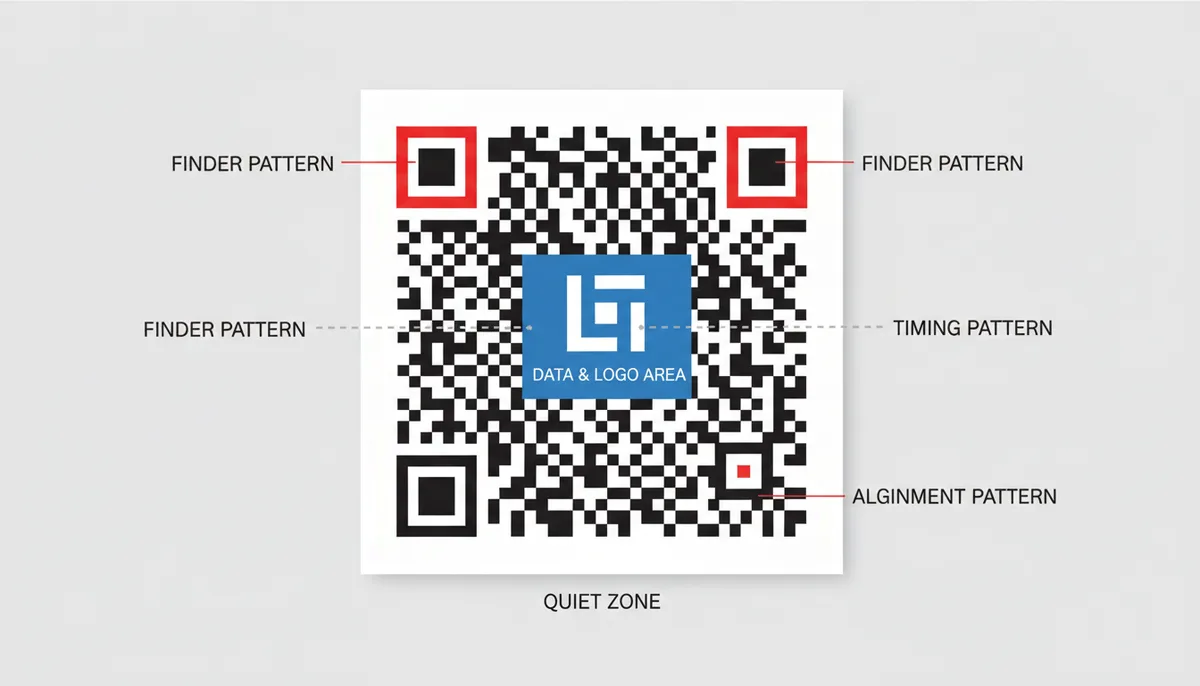
The parts you must never touch:
- Finder patterns. The three large square-in-square targets at the corners. The scanner locates these first, and from their positions it calculates the code's rotation, tilt, scale, and module size. Cover even one and most readers fail outright — there's no partial credit. The deliberately empty fourth corner is what tells the scanner which way is up. This behavior is visible in how real-world decoders work, including the open-source ZXing project.
- Timing patterns. The alternating dark-light dotted lines running horizontally and vertically between the finder patterns. They're the ruler the scanner uses to count modules across the grid.
- Alignment patterns. Smaller target shapes that appear on Version 2 and larger (more of them as codes get bigger). They let the reader correct for distortion — a code photographed at an angle or printed on a curved surface like a coffee cup.
- Format information. Two short strips of modules tucked alongside the finder patterns that store the error correction level and the mask pattern. Tiny, but the code can't be interpreted without them — one more reason the corner regions are off-limits.
- The quiet zone. The blank margin around the whole code. The specification calls for at least four modules of empty space on every side, and scanners rely on it to separate the code from whatever surrounds it.
Everything left over — the dense field of modules filling the center and lower-right of the grid — is your data and error correction territory. That's the only negotiable real estate, and it's where your logo goes. One detail worth knowing before you start recoloring things: the stored bits are scrambled with a data mask, an XOR pattern applied specifically to break up large same-color blobs, because big uniform areas confuse scanners. Your logo deliberately reintroduces a big uniform blob. Keep it modest, keep it centered, and it stays within what the format can absorb.
Step-by-Step: Creating a Scannable QR Code with Your Logo
The whole process takes about ten minutes once your logo file is ready. Here's the procedure, using QR Code Machine's generator, with the reasoning behind each step so you can adapt it to any tool.
- Choose your content type. URL is the most common, but the generator also handles plain text, email, phone, SMS, contact cards (vCard), Wi‑Fi credentials, events, locations, and more. Know going in that your choice affects density: a vCard packs a name, phone number, email, and address into the grid, producing a much denser code than a short URL. Denser codes are less forgiving of logos.
- Keep the payload short. Every character you encode adds modules. A URL like yoursite.com/spring-sale produces a small, open grid; the same page with a long query string of tracking parameters produces a visibly denser one. Bigger modules survive occlusion, print bleed, and camera blur better, so trim aggressively. If you need tracking parameters, that's a job for a dynamic code — covered in its own section below.
- Set the error correction level to H. This is the step everyone skips. In the generator's design and customization options, set error correction to H before you touch anything visual. If a tool you're using doesn't expose the setting at all, don't use that tool for logo codes — you have no way to know what budget you're working with.
- Set your colors with contrast discipline. Dark modules on a light background, always. Deep navy, forest green, or brand-black on white all work; yellow or light gray on white will fail in anything but perfect light. Avoid inverting the code (light modules on dark) — some scanner apps handle it, many don't, and you won't know which until the complaints arrive. Keep the quiet zone light regardless of your color choices.
- Upload your logo and size it conservatively. Use the logo upload option and watch the live preview. Start smaller than feels right — around 15–20% of the code's width — and grow it only until it looks intentional. Stay under 25% of the total code area no matter how good it looks bigger. The tool anchors the logo in the center, which is exactly where it belongs; if you're ever tempted to drag it toward a corner for design reasons, don't.
- Download in the right format. Choose PNG at the highest available resolution for screens, email, and office printing. Choose SVG if the code is going to a designer or a professional print shop — it's infinitely scalable and stays razor-sharp. PDF works when a print workflow specifically asks for it. Whatever you do, don't screenshot the preview: you'll capture a screen-resolution image with compression artifacts, and it will print soft and scan poorly.
- Test before anything goes public. Scan the preview with your phone right now, while it's still on screen — if it fails here, it fails everywhere. Then run the full testing protocol in the next section before you commit to print or distribution.
A habit worth building: judge the preview at arm's length, or zoomed out to roughly the physical size the code will be printed. A logo that looks tastefully small filling your monitor can dominate a 2-centimeter code on a business card.
Preparing Your Logo for a QR Code
The logo that works beautifully in your website header is probably the wrong logo for a QR code. Most brand lockups combine an icon with a wordmark — the company name in type — and that wordmark is the first casualty. At the size a logo occupies inside a printed code, small text collapses into an illegible smudge. It adds coverage area without adding recognition. Use the brandmark alone: the bird, the swoosh, the monogram. If your brand doesn't have a standalone icon, a single-letter monogram on a solid plate beats a shrunken full lockup every time.
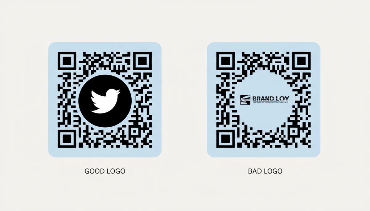
Shape matters almost as much as simplicity. The safe zone in the center of a QR code is roughly square, so a square-ish logo fills it efficiently. A wide rectangular logo is a poor trade: to stay under the coverage limit you'd have to shrink it until it's unrecognizable, and a horizontal bar still sprawls across a large share of a single row of data. If your only logo is rectangular, place it on a square background plate and use that as your upload.
That background plate deserves a moment of its own, because it solves several problems at once. Putting your logo on a solid plate — white is safest, a strong brand color works if it contrasts with the modules — with a little padding around the mark gives you clean separation between logo and code. The plate's crisp edge is what covers the modules, which is far tidier than a logo with an irregular silhouette nibbling into the grid. Rounded corners on the plate read as a deliberate design choice rather than a sticker.
On contrast, be clear about who it's for. The scanner treats the covered area as erased either way — logo contrast against the modules doesn't change decoding. Contrast is for the human deciding whether to scan. A logo that blends into the surrounding modules looks like damage; one that stands apart looks like a brand. Export your final mark as a PNG with transparency at a decent resolution, or SVG if your generator accepts it, and sanity-check it by shrinking it to about 40 pixels on screen. If it still reads at that size, it will read inside a code.
The 5 Most Common Mistakes That Break Branded QR Codes
These five account for nearly every broken branded code you'll encounter in the wild. Each one is avoidable, and each has a signature failure pattern that tells you which mistake you're looking at.
1. The logo is too big
This is the most common one, and it usually comes from a designer optimizing for looks over function. Even at Level H, covering more than 25–30% of the code's surface is gambling, because the logo rarely acts alone — add glare, a scuffed poster, or a cheap phone camera and the combined damage blows through the budget. The signature failure is intermittent scanning: it works on new flagship phones and fails on three-year-old ones. That's the worst kind of broken, because the people who fail just walk away and you never hear about it. The fix is unglamorous: shrink the logo to around 20% and re-test.
2. Covering a finder pattern
This happens with oversized logos, off-center placement, or "creative" decisions to tuck the logo into a corner. The consequence is instant and universal failure — the scanner can't locate the code at all, so it behaves as if no code exists. No phone, no app, no lighting condition will save it. The fix is absolute: logo in the center, full stop, with comfortable distance from all three corners.
3. Low contrast
Two flavors. First, module-versus-background contrast: a yellow or pastel code on white stock, or a light gray code chosen to "match the palette." The camera sees mush in anything short of perfect lighting. Second, inverted codes — white modules on a dark background — which look striking and fail on a large share of scanner apps. The signature here is a code that scans fine at your desk and fails in a dim restaurant or under fluorescent glare. The fix: dark modules on a light background, and test in the worst lighting your audience will actually encounter.
4. Adding a logo to a Level L or M code
Default generator settings are the culprit. Most tools generate at Level M (sometimes L) to keep codes compact, and a 20% logo eats straight past a 15% damage budget. The insidious part is that the code often half-works — it scans on a good camera in good light, so it passes your proof, and then a slice of your audience gets nothing from the 5,000 flyers you printed. The fix: regenerate from scratch at Level H. You cannot patch error correction into an existing code; the underlying pattern itself changes.
5. Eating the quiet zone
This one is usually a layout decision. The designer needs the code to fit a tight space, so they crop the white border or let other design elements crowd up against it. The specification asks for four modules of blank margin on every side because scanners use that emptiness to isolate the code from its surroundings. The signature failure: the code scans on a plain background but fails on the busy final artwork. The fix costs nothing — export with the quiet zone intact, and if the layout is genuinely tight, set the code on a small white card inside the design.
How to Test Your QR Code for Universal Scannability
Your own phone is the worst testing device you own. If it's a recent flagship, its camera and decoding software are among the most forgiving scanners in existence — approving a code on it is like proofreading your own email. You need devices that represent the audience, including the people with older hardware.
A testing protocol that actually catches problems:
- At least two devices: one iPhone, one Android. Ideally one of them is two or three years old — older cameras and slower autofocus are far less forgiving of borderline codes.
- Two different scanning methods per device. The native camera app, plus a dedicated third-party scanner such as Kaspersky's QR scanner or an app built on the open-source ZXing ("Zebra Crossing") library that powers many readers. Different decoding stacks have genuinely different tolerances, and a code that passes one can fail the other.
- Multiple distances. Close-up at 10–15 centimeters, then the realistic use distance: arm's length for a table tent, one to three meters for a poster. A useful rule of thumb is that reliable scan distance is roughly ten times the code's width — a 2-centimeter code will never scan from across a room, no matter how well it's designed.
- Off-axis angles. Test from 30–45 degrees to the side, because nobody stands square-on to a poster or holds their phone perfectly parallel to a menu.
- Real lighting. Bright daylight, dim indoor light, and mixed conditions. If the final piece will be laminated, test it laminated — glossy lamination under downlights is a notorious scanner-killer, and matte laminate behaves completely differently.
- The final substrate. A code that scans off your monitor can fail off uncoated recycled stock, where ink spreads and the crisp edges of your modules bleed together. Print a proof at final size on the actual material whenever the run justifies it.
Set a pass/fail standard before you start: the code should scan in a second or two, every time, on every device. "Eventually works" is a fail. And when something fails, apply fixes in this order — shrink the logo, regenerate at a higher error correction level, increase contrast, enlarge the printed code. The first two solve the majority of cases.
Dynamic vs. Static Codes: The Secret to Better Branded QR Codes
There's a fork in the road before you generate anything, and it changes how friendly your code will be to a logo. A static QR code encodes your final content directly into the grid — the full URL, the whole vCard, the Wi‑Fi credentials. A dynamic QR code encodes only a short redirect URL; when someone scans it, that URL forwards them to your actual content, which lives on a server you control.
The scannability consequence comes from density. A dynamic code stores the same short string whether your destination is a homepage or a 200-character campaign URL, so its grid stays at a low version with big, open modules. A static code carrying a long URL or a full contact card climbs several versions and packs in far more, far smaller modules. Bigger modules print more crisply, survive camera blur, and keep their edges clean where the logo's plate meets the grid — which means the secondary damage that normally stacks on top of your logo largely disappears, leaving almost the entire error correction budget available for the logo itself. Lower density doesn't change the percentage a logo can cover, but it dramatically widens your margin for everything else that goes wrong in the real world.
Dynamic codes bring two more advantages that matter for branded campaigns. You can edit the destination after printing — the classic save when a menu link changes or a landing page moves, because the poster doesn't have to. And you get scan analytics: when, where, and on what devices your codes are being scanned, which is how you learn whether a placement is working. QR Code Machine offers dynamic codes with analytics, plus options like expiration dates and password protection, on its premium plans.
The honest trade-off: a dynamic code depends on the redirect service staying alive. If the provider goes down or your subscription lapses, every printed code pointing through it dies with it. A static code has no such dependency — it works forever, offline, with zero infrastructure. So the decision rule is this: use dynamic for print marketing, campaigns, and anything you might need to update or measure. Use static for Wi‑Fi passwords, plain text, and anything that must work for years with no one maintaining it.
The Print Production Reality: Minimum Sizes and Ink Spread
A QR code that scans flawlessly on your screen can fail the moment it hits paper. The gap between digital design and physical reality is where most professional QR deployments die, and it has nothing to do with error correction levels or logo placement. It is about the physical size of the modules and the behavior of ink on substrate.
Start with the module — the smallest square in the grid. For reliable scanning, each module must print at roughly 0.4 to 0.5 millimeters square (about 12–15 pixels at 300 DPI). Any smaller and camera autofocus struggles to resolve the edges, especially on phones with macro limitations. A Version 3 QR code (29×29 modules) therefore has a hard physical minimum of about 12–15 millimeters (roughly half an inch) across, quiet zone included. A Version 10 code (57×57 modules) needs at least 25–30 millimeters. If your layout demands a code smaller than that, you cannot use a high-version static code carrying a vCard; you must switch to a short URL on a lower version or accept that a slice of your audience will fail to scan.
Then comes dot gain. When ink hits uncoated stock — newsprint, recycled kraft, cheap letterhead — it wicks outward, bloating the dark modules and choking the white gaps between them. A module that measures 0.5 millimeters on your PDF can print at 0.7 millimeters in reality. On coated glossy paper, the dot gain is minimal, but on absorbent uncoated paper, high-gain can turn a readable code into a muddy blob where the modules bleed together. The error correction budget is meant for damage, not for manufacturing variance, so a code with generous white space on screen can arrive DOA in print.
Thermal receipt paper deserves its own warning. The coating is chemically reactive, the surface is rarely pristine, and the "white" background often carries a yellow or gray cast within days of printing. A QR code on a receipt must be oversized — think 20 millimeters minimum — and printed fresh, because thermal images fade with heat and light. If you are putting a loyalty code or return-policy link on a receipt, expect a measurable failure rate after the paper sits in a wallet for a week.
Color management introduces subtler traps. QR codes are defined as dark modules on a light background, but "dark" and "light" are spectral, not subjective. A rich navy blue (C100 M80 Y0 K20) reads beautifully to human eyes but can drop below the contrast threshold for red-channel-sensitive scanner sensors, which rely on luminance, not your brand palette. Worse, if your design places the QR code over a photograph or textured background without a solid white knockout plate, the noise of the underlying image merges with the modules. Always demand a solid white plate behind the code, even on white paper, to prevent show-through from the reverse side or the substrate texture.
The quiet zone is the first casualty of aggressive print layouts. Designers, trained to maximize real estate, nudge the code to the trim edge or let body text creep into the mandatory four-module margin. On a flat sheet this is risky; on a folded piece it is fatal. A code placed near a fold line often has the quiet zone crushed by the mechanical stress of the crease, and a crease running through a finder pattern makes the code unrecoverable. If your code must live near a fold, move it at least 10 millimeters away, and never place it across a fold line.
For dark substrates — black mailers, navy packaging — you cannot simply invert the code to white-on-dark and call it done. White ink is typically a spot color or a double-hit of opaque white, and it rarely achieves the opacity of black on white. The "white" modules show the substrate through, creating mottled contrast that confuses scanners. If you must print on dark stock, use a white rectangular plate large enough to hold the code and its quiet zone, printed solid, with the QR code in standard black on top of that white island.
Before you approve the print run, measure the actual printed code with a ruler. A Version 5 code should be roughly 20 millimeters across; if it is 15 millimeters, the modules are below threshold. Check the quiet zone with calipers if necessary — it should be at least 2 millimeters on each side for a small code, 4 millimeters for a large one. If the printer's PDF export compressed the image or the RIP scaled it to fit, you will catch it here, not when ten thousand unusable flyers hit the warehouse.
Sources
- ISO (International Organization for Standardization) — The technical specifications of QR codes, including the definitions of error correction levels, are defined in the ISO/IEC 18004 standard.
- Denso Wave Incorporated — As the inventors of the QR code, their official site provides authoritative information on the code's structure, versions, and the principles of error correction.
- ZXing Project ('Zebra Crossing') — This open-source barcode scanning library is a de-facto industry standard. Its documentation and source code provide insight into how scanners actually process QR codes, confirming the importance of finder patterns and contrast.
- Adobe Help Center — The section on advanced techniques relies on using vector graphics software. Adobe Illustrator's documentation is an authoritative source for how to work with SVG files, layers, and exporting for print.