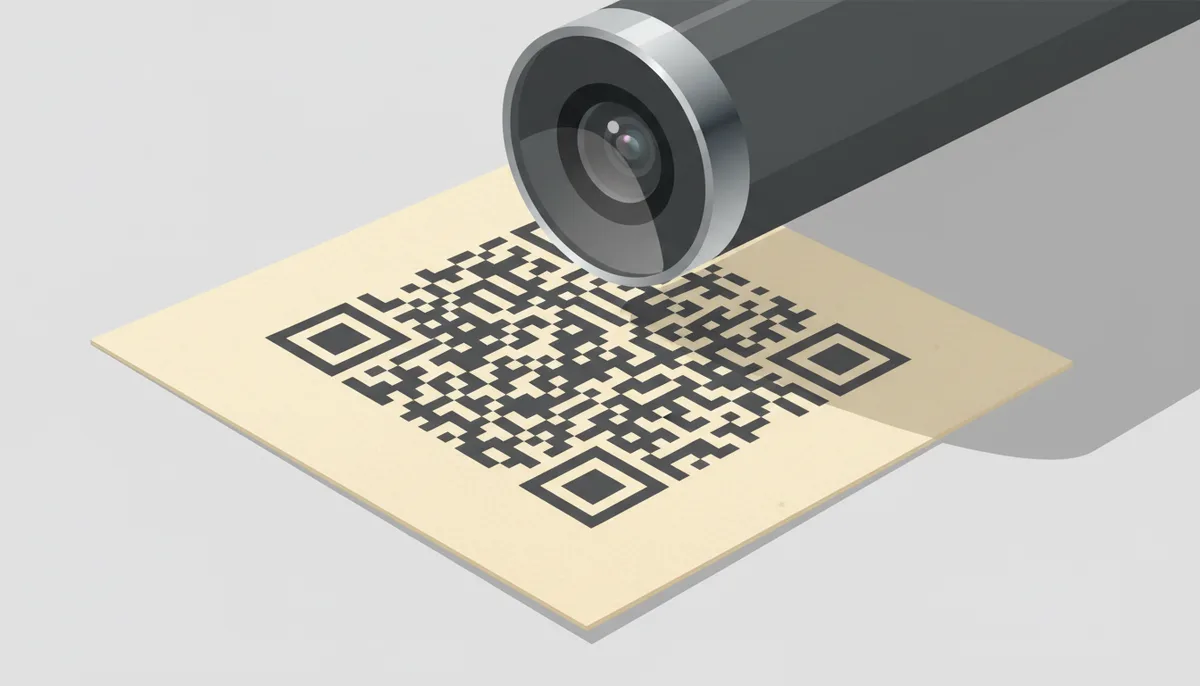
Twenty thousand boxes came back from the printer with a QR code that opened nothing. The designer had checked it on her 27-inch monitor, where it scanned instantly at arm's length. On the shelf, at the width of a business card and printed in a tasteful slate grey, it was a blank square to every phone that tried it. The fix cost a reprint, a freight bill, and a very awkward client call. That story is so common in packaging and print work that most prepress houses have a version of it, and it always traces back to one of three things: the code was too small for the distance, something was crowding its border, or the colors didn't have enough brightness contrast for a camera to separate dark from light.
None of those are aesthetic preferences. They're hard requirements that fall out of how a scanner actually works: a camera captures an image, software thresholds it into dark and light regions, locates the code's corner patterns, and then reads bits. Anything that interferes with that chain — size, spacing, contrast, file quality, surface glare — breaks it. This guide walks through each rule, the reasoning behind it, and the exact numbers you can hand to a designer or a printer. Run them as a pre-flight checklist and you won't be doing reprints.
Why Do On-Screen 'Perfect' QR Codes Fail After Printing?
On a monitor, every QR code enjoys ideal conditions it will never see again. Screen pixels are crisp-edged, backlit from a fixed distance, and rendered in RGB with maximum contrast. The moment you move to ink on paper, dye on fabric, or a pixel grid on a digital sign viewed from across a room, you inherit optics: limited camera resolution, variable lighting, curved and textured surfaces, and a module grid that's suddenly measured in fractions of a millimeter.
The three pillars that decide whether the code survives the transition are independent of each other, and a failure in any one kills the scan:
- Absolute size — the physical width of the code relative to the distance it will be scanned from. This determines whether each individual square in the grid is big enough for a camera to resolve.
- The Quiet Zone — a mandatory empty border around the code. Scanners use it to detect the code's edges and isolate it from whatever sits nearby: text, logos, box seams, photo backgrounds.
- Visual clarity — luminance contrast between the dark modules and the light background, plus clean module edges (which is where file format and print quality come in).
Get all three right and a code survives surprisingly rough treatment. Miss one and no amount of error-correction wizardry will save it.
The Anatomy a Scanner Actually Reads
A QR code isn't a picture in the way a logo is. It's a structured grid, and the decoding algorithm leans on specific landmarks to orient itself. Knowing the landmarks tells you exactly which parts of the code you cannot decorate, shrink, or crowd.
- Modules. The smallest unit: one square, either dark or light. Every rule in this article is measured in modules, and every capacity or sizing decision ultimately comes down to how wide a single module is in millimeters.
- Finder patterns. The three large square-in-square patterns in the corners (top-left, top-right, bottom-left). The decoder finds these first. Their alternating dark/light edges have a fixed 1:1:3:1:1 ratio that lets the software correct for perspective distortion — that's why a code photographed at an angle still reads. Cover or distort a finder pattern and the decoder never gets past step one.
- Timing patterns. Two single-module-wide strips of alternating dark and light squares, running horizontally and vertically between the finder patterns. They give the decoder a reference grid — a ruler — so it can calculate where every module's center sits, even if the print is slightly stretched.
- Alignment patterns. Smaller concentric squares (one or more, depending on the code's version) scattered through the body. From Version 2 upward they exist to let the decoder correct for warping — the curve of a bottle, the sag of a poster. Each one is another landmark you shouldn't paint over.
- The Quiet Zone. A mandatory empty margin, four modules wide on all four sides, that contains no data at all. It's negative space with a job: it tells the scanner "everything inside this boundary belongs to one code."
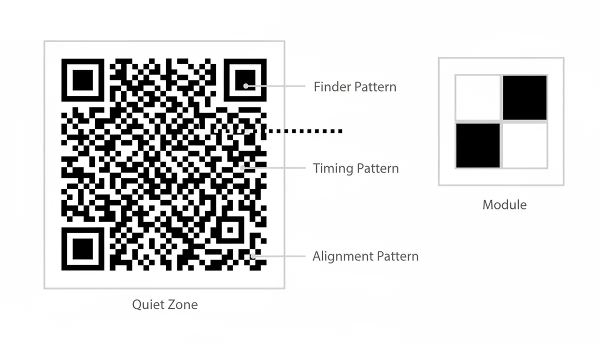
Two more structural details matter once you start editing codes. There are format-information strips — two short runs of modules sitting next to the finder patterns — that record which error-correction level and masking pattern the encoder used. And the only truly safe place for a logo overlay is the geometric center. Everything named above lives at or near the edges and corners, which is why "keep the logo in the middle" isn't a style preference; it's the only region the decoder can afford to lose.
Sizing: Distance Decides Dimensions
Here's the rule that prevents the majority of failures in the field, and it's a heuristic rather than something the ISO standard spells out: a QR code's width should be at least one-tenth of the distance people will scan it from. Written as a formula:
Minimum code width = Scanning distance ÷ 10
The reasoning is optical. A phone camera has a limited number of pixels to spend on your code, and decoding software needs at least a few camera pixels per module to tell dark from light reliably. When the code's physical width is one-tenth of the viewing distance, a typical smartphone ends up with enough pixels per module to decode. Push the ratio much beyond 10:1 and module width in the captured image drops under one pixel, at which point the decoder is guessing.
The rule scales cleanly, which is the whole point of a ratio:
- A business card is scanned at roughly 15 cm, so the math says 1.5 cm — but there's an absolute floor of about 2 cm because phones need a minimum size to focus on at all (more on that below).
- A product box held in a shopper's hands at ~40 cm wants a ≥4 cm code.
- A corridor poster read from 1.5 m away wants ≥15 cm.
- A trade-show banner scanned from 3 m wants ≥30 cm. That surprises first-timers, but 30 cm codes on banners work beautifully precisely because the ratio is respected.
| Use case | Typical scan distance | Minimum code width (distance ÷ 10) |
|---|---|---|
| Business card, held in hand | 15 cm (6 in) | 1.5 cm (0.6 in) — apply the 2 cm floor instead |
| Product packaging on a shelf | 40 cm (16 in) | 4 cm (1.6 in) |
| A4 flyer on a counter | 50 cm (20 in) | 5 cm (2 in) |
| Poster in a hallway or corridor | 1.5 m (5 ft) | 15 cm (6 in) |
| Shop-window decal | 2 m (6.5 ft) | 20 cm (8 in) |
| Trade-show or event banner | 3 m (10 ft) | 30 cm (12 in) |
Two limits cut the other way. First, the absolute floor: below about 2 cm, phones struggle to focus regardless of any ratio, so for anything scanned at arm's length treat 2 cm × 2 cm as the minimum real size. Second, the ceiling on the far end: the 10:1 rule is comfortable, and many modern phones will beat it slightly, but don't design "worse case" codes assuming 12:1 or 15:1 — older devices and cheap Android cameras are your actual constraint, not the flagship model.
One way to cheat the math: move the scan moment closer. A conference badge scanned at check-in from 30 cm away can carry an elegant 3 cm code, while the same link on a roadside billboard needs a code a meter wide. Distance is the input; size is the output. Never bake a size in before you know where the code will be read from.
Data Density: Why Version Dictates Your Minimum Size
QR codes come in 40 standardized sizes called Versions. Version 1 is a 21 × 21 module grid; each step up adds four modules per side, up to Version 40 at 177 × 177. The encoder picks the smallest version that fits your payload at your chosen error-correction level. More characters — a long URL, a filled-out vCard, a WiFi string with a complex password — mean a higher version, and a higher version means more modules crammed into the same square.
That cramming is what shrinks your effective minimum size. Compare module widths for a square printed at 25 mm:
- Version 1 (21 modules per side): each module is ~1.19 mm wide. Generous. Almost any camera resolves this.
- Version 10 (57 modules per side): each module is ~0.44 mm. That's getting thin — cheap cameras at arm's length start failing here.
- Version 20 (97 modules per side): each module is ~0.26 mm. At this density you're printing a code most phones can only read under perfect light, dead-on, with a recent sensor.

The practical move is to shrink the payload, not hope for better cameras. A static code that encodes a full destination URL forces density; a dynamic QR code encodes only a short redirect URL, so it lands at a low version with fat, legible modules. Generating a dynamic code on QR Code Machine, for instance, means the printed grid stays sparse no matter how long the final destination link is — and you can retarget that destination later without reprinting. The trade-off you're accepting: the code depends on a redirect service, so use a provider you trust to stay alive. For anything printed in volume, that trade is worth it. Sparse grid, editable target.
There's a corollary worth engraving: the minimum size printed on the spec sheet applies to the version you actually ship. A "25 mm minimum" recommendation is comfortably true for a Version 1–3 code. Bump the payload to Version 15 and that same 25 mm square is now hostile territory.
The Quiet Zone: Four Modules, No Exceptions
The ISO/IEC 18004 standard — the formal spec for QR codes, maintained since Denso Wave's original design — makes one spacing requirement unambiguous: a clear margin of at least four modules on all four sides. Not a "nice-to-have." Mandatory.
The mechanism is straightforward. When software searches an image for a QR code, it looks for the distinctive corner patterns and then tries to draw a bounding box around the candidate. It can only do that if there's a buffer of empty, uniform space separating the code from everything else in the frame. When copy text, logo edges, or photographic content crowds right up to the code's border, the edge-detection step fails or — worse — silently grabs a neighboring graphic lump and concludes the code is malformed. You get a misscan, or nothing.
The failures we see in print production are all the same few shapes:
- The code was cropped to "save space" on packaging, so one side has zero border.
- The label text or tagline abuts the code, sometimes so a hairline of text pixels overlaps the edge modules.
- A photo or pattern continues behind the code, so the "border" is filled with imagery instead of empty.
- The code straddles a fold or a dieline, where the paper curve destroys the quiet margin on one or two sides.
Size the zone in real units so a designer can't wiggle out of it. Take a 2 cm Version 1 code: divide 20 mm by 21 modules and a module is ~0.95 mm; four modules is roughly a 4 mm clear ring. For a 10 cm Version 3 code (29 × 29), each module is ~3.4 mm, and the required ring is about 1.4 cm. Put that number on the artwork handoff: "QR code to sit with a minimum clear space of X mm on all sides." Also quote the total footprint: a 2 cm code with its border really consumes about 2.8 cm of square. Layouts that only budgeted the code itself are how zones disappear in the first place.
One workaround deserves mention because it fails so consistently: lightening the quiet zone to a tint or soft gradient to "keep the design continuous." The decoder needs uniform light margin. A pale gradient is usually fine; a brand-colored pattern with visible texture in the margin is not.
Contrast and Color: Luminance Is the Whole Game
Scanners don't see color; they see brightness. The first thing decoder software does is convert the camera frame to grayscale and threshold it into "dark modules" and "light background." Whether a code reads comes down to one number: the brightness (luminance) difference between those two populations of squares.
A practical yardstick borrows the exact relative-luminance math used by the Web Content Accessibility Guidelines (WCAG) — a rule usually applied to on-screen text legibility — because it gives anyone with a color picker a way to test a pair of colors numerically. WCAG contrast ratios run from 1:1 (identical) to 21:1 (pure black on pure white). Treat 4:1 as a bare floor for QR work and 7:1 as the comfortable target, especially once the code is no longer on a perfect backlit screen. Any free contrast-ratio checking tool (the ones web designers use for accessibility audits) will compute this from two hex values in seconds.
Combos that reliably fail, and the reason each fails:
- Yellow or pastel modules on white — yellow on white barely exceeds 1:1. The camera sees the code as a uniform smudge of lightness.
- Light grey on white, dark grey on mid-grey — gentle ratios that a studio monitor resolves but a phone in a fluorescent-lit store cannot, once ambient light compresses the captured range.
- Navy on black, maroon on black — two darks. Inverted ordering doesn't rescue low ratio.
- Gradients inside the symbol — a module-to-module luminance gradient means the threshold line carves through mid-module; some squares flip to the wrong side and the data corrupts.
Two more positions, held firmly. First: don't invert. Light modules on a dark background is outside the original standard's assumption, and while modern phone decoders increasingly handle it, a meaningful share of app-based scanners and older devices simply won't. If the brand wall has to be dark, put the code in a white or near-white panel and keep a dark symbol inside it. Second: beware of saturated mid-dark colors. Deep blue or dark green on white often works, but CMYK conversion in the print pipeline can drag saturation and shift perceived luminance enough to slip under the ratio — always re-check the contrast after the conversion, on print proofs, not just in the RGB design file.
Print-side nuance that experienced prepress people will add if you don't: specify the code's dark modules as 100% K black rather than a rich black built from all four CMYK plates. A four-plate black depends on perfect registration; a half-millimeter of drift between plates fringes module edges with color ghosting, which to a scanner is edge blur. Single-plate black prints its squares in one pass, one ink, perfect edges by construction.
File Format and Resolution: Vector for Print, Discipline for Raster
The question is really: will the module grid survive scaling? Vectors and rasters answer it differently.
Vector formats (SVG, EPS, PDF-exported vectors) store the code as geometric shapes. A module edge is a mathematically exact line, whether the code is scaled to a postage stamp or a building wrap. Nothing blurs, nothing pixelates, and registration of the sharp edges is perfect at any output resolution the printer's RIP supports. For anything going to print, vector is the default answer. See Adobe's explanation of image file formats for why vectors scale without quality loss.
Raster formats (PNG) store pixels, so their quality is bound to the resolution exported. Rules that hold in practice: need ≥ 300 DPI at the final printed size (and 600 DPI for small codes with dense grids); export large and size down, never up — upsizing a small PNG forces the software to invent pixels between squares, which is exactly the blur the scanner fails on; and scan the exported PNG for anti-aliasing, the softness routine that grays the module edges. Many generators emit hard-edged pixel grids that scale down cleanly; a code that arrives with visibly feathered edges needs to be regenerated with sharpening disabled, not rescued in Photoshop.
JPG is the one format on the list you can dismiss outright. Its lossy compression creates ringing artifacts — halos of wrong-colored pixels — precisely at high-contrast edges, which is to say, at every single module boundary. A JPG'd QR code can read on a fresh phone in good light and fail everywhere else. Never ship one.
| Format | Type | Scalability | Risk of module blurring | Professional recommendation |
|---|---|---|---|---|
| SVG | Vector | Infinite — any size stays sharp | None | Default choice for all print work |
| EPS / PDF | Vector | Infinite — any size stays sharp | None | Use when the printer's workflow asks for it |
| PNG | Raster | Limited to exported resolution | High if upsized or anti-aliased | Fine for web, email, and screens at ≥300 DPI equivalent |
| JPG | Raster | Limited; lossy compression | Severe — artifacts at every module edge | Do not use for QR codes |
And keep color spaces straight: design and preview in RGB for screens (web, email, social), and treat the move to print as a deliberate handoff — someone must convert the file to CMYK for the press, and someone (the same person, ideally) must then re-verify the contrast ratio of the converted colors. A saturated RGB blue that scanned at 8:1 can land in CMYK as a muddier, less separated dark that barely clears the floor.
None of this stays theoretical once the proof hits the table. A code shipped as an upsized, feathered PNG will fail the 1:1 proof scan for reasons that have nothing to do with the size, margin, or contrast you specced — which poisons the test you were about to run. Get the file right first and the proofing pass measures the things that actually matter. If a proof fails and the failure traces back to softened module edges, the fix happens here, not in the layout.
Error Correction: Redundancy Has a Price
Every QR code carries spare data beyond the payload itself so that damage, dirt, or partial obstruction can be mathematically reconstructed at decode time. The standard defines four levels, and the percentages are the share of the symbol that can be lost while still reading correctly:
- Level L (Low) — about 7% recoverable.
- Level M (Medium) — about 15% recoverable.
- Level Q (Quartile) — about 25% recoverable.
- Level H (High) — about 30% recoverable.
That resilience isn't free. Redundancy codewords occupy grid space, so for a fixed payload a higher error-correction level can push the encoder into a higher Version — which, as the earlier section showed, shrinks every module. Crank everything to H "to be safe" and you may have made your code less scannable by moving it up two versions. This is the trade-off nobody mentions on marketing pages and the one that bites in production.
Positions to take, then:
- Default to Level M. Fifteen percent recovery, moderate density, and the setting that balances clean scans with reasonable real-world punishment. For a well-printed, quiet-zoned code, M is enough.
- Use Q or H only for a reason. The two legitimate reasons are (a) you intend to drop a logo over the code's center, or (b) the code will live somewhere harsh — on a floor decal, an exterior sign, machinery that gets scuffed.
- If you overlay a logo, respect the geometry. The center is the only expendable region. Finder patterns, the timing strips, the alignment patterns, and the format-information modules near the corners must all stay intact. The logo-in-the-middle generators (including the logo-embedding option in QR Code Machine) work for exactly this reason: they confine the overlay to the middle blocks that H-level redundancy can reconstruct.
Treat error correction as an insurance policy with a premium, not a free upgrade. Choose the level for the hazard you actually face.
Substrate, Texture, and Curvature: Where Codes Go to Die
Even a correctly sized, bordered, and contrasted code can be undone by the surface it lands on. Three physical-material problems account for most of the field failures the previous sections don't cover.
Gloss and specular reflection. A laminated menu, a varnished package, a badge under glass: any shiny finish can throw a glare streak across the code at reading angle, and to a thresholding algorithm that white flare erases modules wholesale. The fix is boring and reliable — matte finish. If brand demands gloss, position the code so the direct lamp reflection in the typical reading position falls outside it, which is precisely the kind of thing to verify on a physical proof rather than in a layout app.
Texture and dot gain. Fabric weaves, unfinished wood, recycled or heavily textured stock: each distorts the squareness of modules. T-shirt screen printing is the classic failure — ink spreads into the weave and modules come out pill-shaped. On uncoated paper, ordinary press dot gain makes dark modules grow and light gaps shrink, which can flip marginal contrast into failure. Practical counters: choose coated/matte stock where possible, print the code a size up on textured substrates, and consider bumping error correction one level when shrinkage-and-spread is unavoidable.
Curvature. Bottles, cans, tubes: the moment the code wraps around a cylinder, rows of modules start foreshortening toward the edges until the grid no longer resolves. A working ceiling that holds up in practice: keep the code's wrap to roughly 5–10 degrees of the surface arc across its width, and put the code on the flattest panel the object offers. Beyond that, the alignment patterns can only compensate so much. And test on the actual object, chilled if it will be scanned chilled — a condensation-misted fridge bottle is a different optical situation from a dry proof.
One more substrate trap, packaging-specific: never let a code straddle a fold, crease, or seam where the carton bends. The geometry changes every time the box flexes, which turns a marginal scan into a coin flip.
The Pre-Flight Checklist and the Only Test That Matters
Everything above reduces to a checklist a designer can run in a couple of minutes. If your team prints codes more than once, laminate this list:
- Size: code width ≥ scanning distance ÷ 10, and never below ~2 cm for arm's-length use.
- Density: lowest possible Version. Verify the payload was minimized — dynamic codes with short URLs keep the grid sparse by construction.
- Quiet Zone: four modules of uniform empty margin on all four sides, measured and quoted in mm on the artwork handoff.
- Contrast: luminance ratio ≥ 4:1, verified on the final CMYK values, with dark modules specified as 100% K where possible. No inversion, no gradients.
- Format: SVG (or EPS/PDF vector) for print. PNG only for screen use, exported at ≥300 DPI equivalent, with no anti-aliasing. No JPG, ever.
- Error correction: Level M by default; Q/H only for logo overlays or harsh environments. Finder, timing, alignment, and format modules unobstructed.
- Substrate sanity: matte preferred, flat surface chosen, wrap kept under ~10 degrees, no folds or seams crossing the code.
- Real-world test: performed, and passed, before production sign-off.
The last item carries the rest on its back and skipping it voids the whole checklist. The protocol that actually catches problems:
- Print a 1:1 proof at final size, on the actual substrate where possible (or the closest stock you have).
- Scan with an iPhone's native camera and an Android camera / Lens — both, because decode pipelines differ.
- Scan from the intended distance and angle, not from the comfortable desk distance.
- Scan under the worst plausible lighting: dim corridor light, glare from a window, fluorescent tubes.
- Scan with one older phone in the mix; a four-year-old budget device is the honest benchmark.
- For dynamic codes, confirm the redirect lands on the right destination and that tracking (QR Code Machine's analytics, if that's the generator in use) registers the test scans.
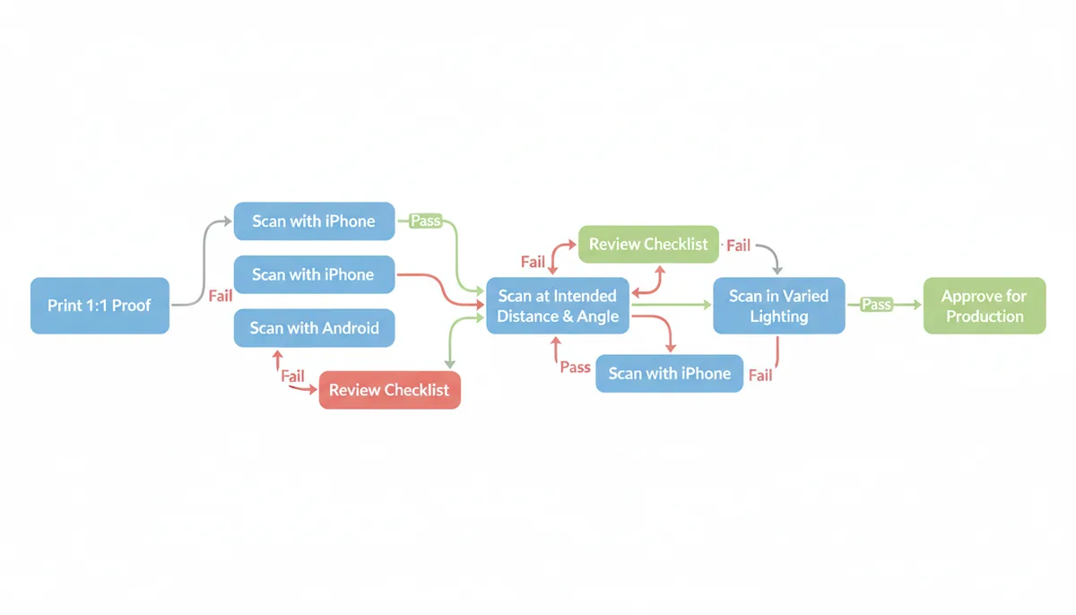
Codes that pass that gauntlet and fail in the field are rare enough that each one deserves a forensics file — usually the culprit is a substrate decision (gloss laminate, cylinder wrap) that slipped past item seven.
A Worked Example: Speccing One Code from Brief to Press
Rules make more sense when you watch them collide with a real job. Here's a composite of the kind of brief that lands on a packaging designer's desk: a specialty coffee roaster wants a QR code on a 250 g retail bag, linking to a brew-guide video page. Walk through the decisions in order and the spec nearly writes itself.
1. Fix the distance before anything else. A shopper picks the bag off the shelf and scans while holding it — call it 40–50 cm. The 10:1 rule gives a minimum width of 4–5 cm. Settle on 45 mm.
2. Shrink the payload, not the print. Marketing's first instinct is the full campaign URL with UTM tracking parameters attached — ninety-odd characters of it. Encoded as a static code, that payload climbs several versions up the grid; a short dynamic redirect URL of twenty-odd characters stays down in the bottom few. Take the dynamic code and put the UTM parameters on the redirect destination instead, where they cost no modules at all.
3. Do the module arithmetic. Say the short payload lands at Version 3 — a 29 × 29 grid. At 45 mm wide, each module is about 1.55 mm: fat, forgiving, resolvable by almost anything with a camera. Now look at the road not taken: that UTM-laden static URL at, say, Version 10 is a 57 × 57 grid, and the same 45 mm box now holds modules of roughly 0.79 mm. Same physical size, half the resolving power. This is the decision that determines whether the code works on a four-year-old phone, and it was made in step 2, not at the printer.
4. Quote the Quiet Zone in millimeters. Four modules at 1.55 mm is about 6.2 mm of clear ring, so the code's true footprint is 45 mm plus roughly 12.4 — round up and tell the layout artist to reserve a 58 mm square. If you only hand over "45 mm," the border will be the first thing sacrificed when the layout gets tight.
5. Catch the substrate trap. The bag is a kraft-look recyclable pouch — mid-tone brown stock. The brand's dark-roast brown ink on kraft measures around 3:1 with a contrast checker: under the floor, dead. Straight black on kraft often lands near 7:1, which passes on paper but leaves no margin for the dot gain you get on uncoated stock — the dark modules spread, the light gaps shrink, and the ratio erodes on press. The professional answer is a matte white panel (or a white ink underbase) printed first, with the code in 100% K black on top. That costs one extra plate and buys you near-maximum contrast regardless of the stock underneath.
6. Pick error correction for the actual hazard. Coffee bags get scuffed in transit cartons and dragged across shelves. Bump from M to Q. Because the payload stayed short, Q doesn't push the version anywhere painful — insurance purchased, density preserved. No logo overlay is planned, so H would be redundancy bought for no reason.
7. Place it on the geometry that exists, not the geometry you want. Front panel, flattest zone, clear of the side gussets, the back fin seal, and the crimped top — a code that crosses any of those flexes and distorts every time the bag is handled. If the bag gets a flood varnish, spec it matte over the code area or leave the panel out of the coat entirely; a gloss stripe across the code under store downlights is a glare machine.
8. Hand off the file and the proof protocol. SVG to the printer, dark modules as 100% K. Proof on the actual pouch film — not paper — then scan with a current iPhone, a budget Android, at 50 cm, under retail-style lighting, and confirm the dynamic redirect lands on the right page with analytics registering the hit.
What the designer hands to prepress, in the end:
- Dynamic code, short redirect URL, destination carrying the UTM parameters
- Printed width: 45 mm; Quiet Zone: 6.5 mm minimum on all four sides (reserve 58 mm)
- Color: 100% K black on a matte white panel
- Error correction: Level Q
- File: SVG
- Placement: front panel, flat zone, clear of all seals and folds
- Sign-off: physical proof on pouch film, passing the full scan gauntlet
The cost ledger is worth one line. The white panel, the proof, and the testing afternoon add maybe a day and a trivial sum to the job. The alternative — the slate-grey-code story from the top of this article — is a reprint of the entire run plus the freight. Every decision above is free at design time and expensive at press time, which is the whole argument for speccing codes this way.
Frequently Asked Questions
What is the absolute smallest a QR code can be?
For close-range scanning (roughly arm's length, 10–15 cm), the practical minimum is about 2 cm × 2 cm (0.8 in × 0.8 in). Below that, phones start struggling to focus on the symbol at all, and module widths shrink under the size a typical camera can resolve. The 10:1 distance rule may mathematically allow smaller at very short distances, but the 2 cm floor overrides it — treat sub-2 cm codes as experimental, not production.
Can I use colors other than black and white?
Yes, as long as the luminance contrast between dark modules and light background stays high. Dark navy, deep green, or maroon on white usually work fine. Yellow or pastel on white fails. Measure it: run your two hex values through any contrast checker and keep the ratio at 4:1 minimum, 7:1 preferred — and re-check the numbers after CMYK conversion for print, because conversions can drag a borderline pair under the floor.
Do I really need that empty border (Quiet Zone)?
Yes, and it's not negotiable. The ISO/IEC 18004 standard requires a minimum of four modules of clear, uniform margin on all four sides. Decoder software depends on that empty ring to find the symbol's edge and separate it from nearby text and graphics. A code that touches adjacent art might scan in one app and not another — which is the worst kind of failure, because it looks random.
Why does my QR code scan on my new phone but not my friend's older one?
Module size versus camera resolution. Newer flagship phones capture enough pixels per module to decode dense or small codes; budget devices several years old can't resolve those modules, so the code that "works" on your device is silently excluding a share of your audience. The fix: reduce data density (lower Version — a dynamic short-URL code does this automatically), respect the 10:1 sizing rule, and include at least one older phone in your test passes.
Is SVG or PNG better for a QR code?
For print, SVG — vector math keeps module edges exact at any size, from a business card to a billboard. For web, email, and on-screen use, PNG is fine, but export at the resolution the use case needs (≥300 DPI equivalent for anything print-adjacent) and avoid anti-aliased edges. Whatever the situation, don't ship JPG; its compression artifacts blur exactly the edges decoding depends on. See Adobe's image format guidance for more detail.
How much of a QR code can be covered by a logo and still work?
There's no universal safe percentage, and the numbers people quote usually measure something else. Error-correction percentages — about 30% at Level H, 25% at Q, 15% at M, 7% at L — describe how much of the code's data the decoder can reconstruct when the symbol is damaged. They don't guarantee that a logo occupying that share of the symbol area will still scan, and treating them as a coverage allowance is how logos kill codes. What actually governs it: keep the overlay small, sit it in the geometric center, and stay clear of the three finder patterns, the timing strips, the alignment patterns, and the format-information modules near the corners — those landmarks are non-negotiable no matter how much redundancy you bought. Beyond placement, stack the odds: generate at Level H, keep the payload sparse so the version stays low and the modules large, and treat the design as unapproved until a physical proof scans cleanly across several devices.
Will a QR code on a T-shirt or a crumpled flyer scan properly?
It's a gamble, and the odds improve with specific countermeasures. Fabric stretch, weave texture, and folds distort module geometry, and creases flip modules to the wrong contrast side. If it must be done: use Level H error correction, keep the payload minimal so the version stays low and modules stay large, print on the flattest region available, and test on the actual garment or folded piece — not on a flat mockup.
Every rule here exists because a scanner somewhere failed without it. Size from the distance, keep the payload sparse, respect the four-module border, buy contrast with luminance not preference, ship vectors to the printer, and never approve a code that hasn't survived a beat-up test pass. That's the whole discipline — and it fits on one page the designer can tape to the monitor.
Sources
- ISO (International Organization for Standardization) — The official specifications for QR Code 2015 (ISO/IEC 18004:2015), which defines versions, error correction levels, and the mandatory 4-module Quiet Zone.
- Denso Wave — Information from the original inventor of the QR Code, backing claims about the fundamental structure, including finder patterns and modules.
- W3C Web Content Accessibility Guidelines (WCAG) — The technical standard for digital contrast ratios (e.g., 4.5:1 for normal text), which provides an authoritative basis for the recommended contrast between QR code modules and the background.
- GS1 — General principles and standards for barcode print quality, verification, and scannability in supply chain and retail environments, which reinforce the importance of substrate, resolution, and contrast.
- Adobe Help Center — Authoritative explanations on the differences between vector (SVG, EPS) and raster (PNG, JPG) image formats, supporting the recommendation to use vector for print scalability.