
A QR code with your logo punched into the center is, technically, a damaged code. The trick is that it’s damaged on purpose, within a budget the format hands you, and that budget is called error correction. Once you understand how that allowance is calculated and where it’s safe to spend it, custom codes stop being a gamble and become an engineering decision.
Why a Damaged QR Code Still Scans
The poster at the bus stop has a torn corner. The shipping label survived rain and a forklift scrape. The conference badge got bent in someone’s pocket. You point your phone at any of these and the link still opens — even though chunks of the pattern are simply gone.
That recovery isn’t a camera trick and it isn’t the scanner guessing. Every QR code carries spare information beyond the data it actually needs to deliver. When the format was designed at Denso Wave (and later standardized as ISO/IEC 18004), the engineers built redundancy in from the start: alongside the data codewords — chunks of eight bits that hold your URL or text — the code stores error correction codewords, calculated from the data with a method called Reed-Solomon. Lose some modules, and the math reconstructs what was there.
Here’s the part that matters for design: the scanner cannot tell the difference between a module destroyed by a scratch and a module covered by your logo. Damage is damage. So when a designer embeds a logo, they are deliberately spending the recovery budget — and the job is to spend less than the budget allows. Colors are a separate problem, and we’ll get to them, because no amount of redundancy fixes a module the scanner can’t see in the first place.
The Anatomy of a QR Code: Which Parts Are Load-Bearing
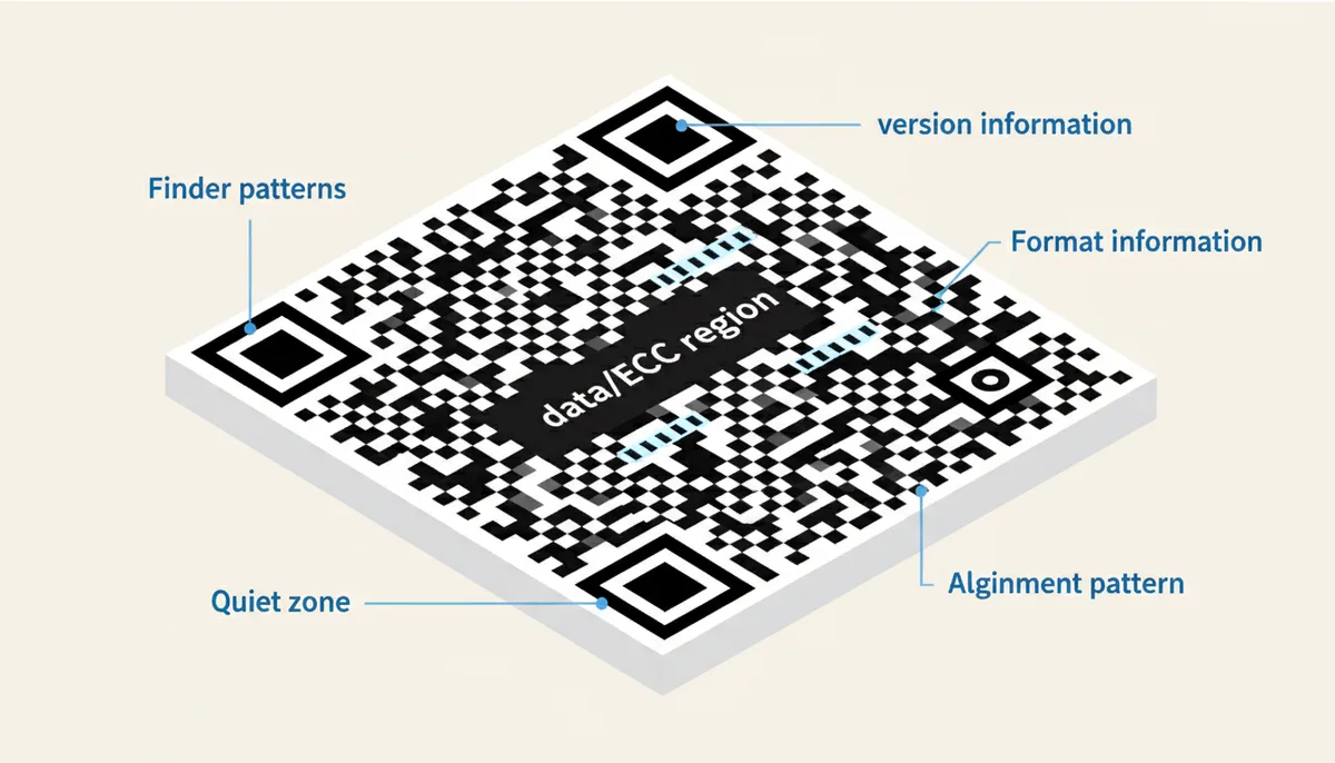
Before you can safely obstruct anything, you need to know what you’re obstructing. A QR code is a grid of modules — the individual black or white squares — and some modules are structural while others are expendable. The structural ones:
- Finder patterns. The three big nested squares in the corners. The scanner uses them to find the code and figure out which way is up. Cover even one and most scanners fail instantly.
- Alignment pattern(s). Smaller bullseye-like squares that appear away from the corners (one in most medium codes, dozens in large ones). They let the scanner correct for a curved bottle or an angled shot. Don’t cover these either.
- Timing patterns. The alternating black-white stripes running between the finder patterns, horizontally and vertically. They’re the scanner’s ruler — they define the module coordinate system.
- Format information. Two short strips next to the finder patterns, stored twice for safety. They tell the scanner which error correction level and which masking pattern the generator used.
- Version information. Present from Version 7 upward (versions run from a 21×21 grid up to 177×177). Also duplicated, also off-limits.
- Quiet zone. The blank border around the whole code — the specification demands four modules of empty space. Scanners find codes by looking for a sudden contrast change; if artwork or text crowds the edge, detection gets unreliable.
Everything left over — and that’s most of the grid — is the data and error correction region. That region is where your logo and your obstructions go, because those codewords are precisely the ones redundancy can rebuild. A design that respects the finder patterns, the edges, and the quiet zone has enormous freedom everywhere else.
How Reed-Solomon Error Correction Actually Works
Start with the simplest version of the idea. Suppose you transmit the numbers 12, 7, and 40, and you append their sum, 59. If the recipient receives 12, [smudge], 40, 59, they can solve the missing value: 59 − 12 − 40 = 7. That’s a checksum — crude, but it shows the principle: extra, calculated information turns missing values into solvable equations.
Reed-Solomon does the same thing at industrial strength. The generator splits your data into codewords, optionally splits those into blocks for longer codes, and computes error correction codewords from each block using polynomial arithmetic over GF(256) — a number system with exactly 256 values, chosen because a byte has exactly 256 possible values. The two kinds of codewords get interleaved across the grid, which is why a torn corner doesn’t wipe out one whole block: the damage gets spread thin enough for the math to handle.
This isn’t exotic technology. The same algorithm family keeps scratched CDs and DVDs playable and has been trusted in satellite and deep-space communications, where retransmission is impossible. It earns that trust because of one crucial behavior: the result is binary. If the damage is within the block’s correction capacity, the decoder reconstructs the original data perfectly. If it exceeds capacity, the decoder refuses and the scan fails. It essentially never produces wrong data — which is why a logo either works or doesn’t, and never silently redirects someone to the wrong URL.
The obvious follow-up: if reconstruction is free, why not use maximum correction always? Because error correction codewords occupy the same finite grid as your data. More spare capacity means less room for content. That trade-off is exactly what the four levels formalize.
The Four Error Correction Levels
Every QR code picks one of four standardized levels, and the percentage tells you roughly how much of the encoded codewords can survive corruption:
| Level | Letter | Approx. Recovery | Best For |
|---|---|---|---|
| Low | L | ~7% | Clean digital display (screens, PDFs) where capacity matters most |
| Medium | M | ~15% | Everyday marketing and general use; the common default |
| Quartile | Q | ~25% | Outdoor signage, packaging, industrial surfaces that abrade or get dirty |
| High | H | ~30% | Any code carrying a logo or heavy customization |
The trade-off is version size. Capacity depends on both level and content length: a short URL in byte mode (the encoding mode used for general text) fits in a compact grid even at Level H, while a long vCard — name, company, phone, email, address — at Level H can push you up several versions, shrinking every module. Smaller modules print worse and scan slower. So the deciding rule is this: use L only for on-screen codes, accept M for ordinary print, choose Q for hostile physical environments, and always, always choose H the moment a logo enters the picture. If your content is long, shorten it — more on that in the dynamic codes section — rather than dropping the level.
Most generators default to Level M because it’s the sensible middle. That default is exactly why thousands of logo-stamped codes fail: somebody customized a code that had no budget left to spend. Change the level before you touch the design.
How to Safely Add a Logo to Your QR Code
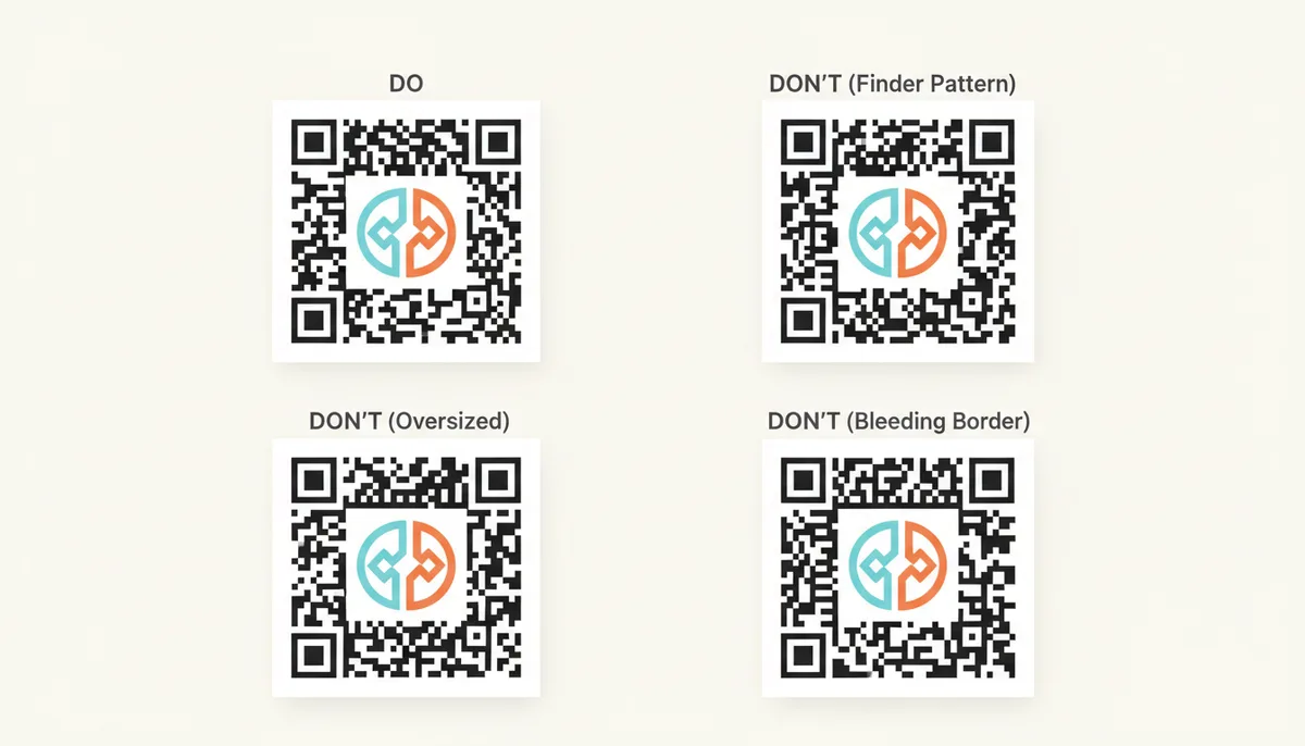
Treat logo placement as planned obstruction with a receipt. Level H lets you corrupt roughly 30% of the codewords, but codewords and visible area aren’t the same unit, and scanners vary in tolerance. So translate the budget into an area rule with a safety margin: keep the logo under about 20–25% of the code’s total surface. That margin absorbs thick logo borders, drop shadows, and modules the scanner misreads for other reasons.
- Generate the base code at Level H before any artwork happens. QR Code Machine and every serious generator expose this as a setting; make it your first move, not your last.
- Place the logo dead center — then verify. On low-version codes the center is pure data region, but higher versions scatter alignment patterns across the grid, and one can sit near the middle. Before locking placement, check the generated code for alignment patterns under the logo area, or use the generator's logo-safe zone if it marks one. Finder patterns, timing strips, format and version information, the quiet zone, and alignment patterns must all stay clear.
- Measure area, not width. A logo that’s half the code’s width is a quarter of its area only if it’s square; with a rectangular mark, compute the bounding box honestly.
- Keep the quiet zone untouched. Decorative frames, slogans, and badge shapes must stop four modules short of the grid.
- Test on at least three real devices — a recent iPhone, a recent Android, and one older phone — at the final physical size. Screen test passes prove nothing about print.
The failure pattern you’ll meet most often: logo creeps toward a corner “because the brand guide says so,” covers a finder pattern, and the code goes from perfect to dead on every device. The second most common: logo sized correctly at Level M, because the designer never changed the level, leaving a 30% obstruction spending against a 15% budget.
Colors and Contrast: What Scanners Actually See
Your phone doesn’t read color. The scanner converts the camera image to pure black and white — a process called binarization — and then reads the modules. Everything hinges on one question: is the lightest module dramatically brighter than the darkest? Hue is decoration; luminance is signal.
That produces a hard rule: dark modules on a light background. Inverted codes — white modules on black or navy — do work in some modern camera apps, but they fail on many dedicated scanners and older devices, and there’s no setting in the ISO standard that declares inversion legal. For anything printed for the public, inversion is a compatibility tax you don’t need to pay.
Brand managers still get their colors — just pick the brand palette’s darkest hue for modules and let the background be a pale tint. The combos that actually break codes: yellow on white (both high-luminance), navy on black, mid-gray on mid-gray, and any gradient or photo background where the luminance shifts from module to module.
If you want a measurable threshold instead of vibes, use a digital contrast checker and hold your module/background pair to a contrast ratio of at least 4.5:1. That number is borrowed from the WCAG accessibility guidelines for normal text — the QR spec itself doesn’t mandate a ratio, but 4.5:1 is a proven, conservative floor. One more wrinkle: glossy stock, laminated badges, and curved plastic introduce reflections that smash contrast at certain angles. Matte surfaces keep that problem small.
Troubleshooting: Why Your Custom Code Won’t Scan
Failures fall into a handful of repeatable patterns, and each one points at a specific fix:
| Symptom | Likely Cause | Fix |
|---|---|---|
| Scan fails instantly on every device | Logo covers a finder pattern, or the quiet zone is gone | Recenter the logo; restore a four-module blank border |
| Camera focuses but never decodes | Contrast too low — yellow on white, navy on black | Recolor dark-on-light; verify ≥4.5:1 with a contrast checker |
| Works on some phones, fails on others | Inverted colors or borderline contrast | Flip to dark modules on light background; raise the ratio |
| Scans on screen, fails in print | Modules printed too small or blurred | Print larger; export SVG or PDF; cut the data length |
| Scans on flat paper, fails on a curved bottle | Distortion defeats the grid on a small code | Increase the printed size; move the code to a flatter area of the surface; reduce the data density; step up to Level H if a logo or artwork is present |
Notice the recurring diagnosis in rows three and four: data density. A static code stores everything — a long URL, a whole vCard — directly in the grid. More data means a higher version, and higher versions mean smaller modules. If you’re printing at business-card size, those tiny modules smear on cheap printers and defocus in low light. The remedy is nearly always the same: encode less data, which is precisely what dynamic codes exist for.
Why Dynamic QR Codes Are a Designer’s Best Friend
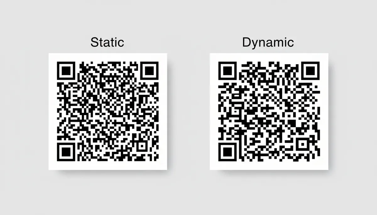
A static QR code embeds the final content directly — the URL, the WiFi credentials, the vCard. A dynamic QR code embeds only a short redirect URL; the scanner hits that URL, and the service forwards the user to the real destination. The redirect destination is editable after printing, and the service can log scan counts. Those conveniences are nice, but the design payoff is better: a short redirect keeps the grid sparse.
Compare encoding “https://example-store.com/catalog/spring-sale?utm_source=poster” in a static code versus embedding something like a twenty-character short link. The static version needs a dense, high-version grid; the dynamic version can stay at a low version even at Level H, with large, generous modules. Large modules print cleanly, read fast, and give your logo real room inside the budget. QR Code Machine supports dynamic codes alongside static ones, and the redirect option appears right in its type list.
The honest trade-off: dynamic codes depend on the redirect service staying alive, and on many platforms they sit behind an account. For offline content — a WiFi password, a plain vCard — static is the only correct choice, because there’s nothing to redirect through. For every marketing link longer than a few words, dynamic wins on scannability, and scannability is the whole game.
A 60-Second Pre-Flight Checklist
- Level set to H if any logo or artwork touches the code.
- Logo area under 20–25% of total surface, centered.
- Dark modules on a light background, contrast ≥4.5:1.
- Four-module quiet zone intact on all sides.
- Static code only if the content is genuinely short; otherwise go dynamic.
- Print from SVG or PDF; PNG only for fixed-size screen use.
- Passed a live test on three different phones at final size.
A Worked Example: Sizing a Logo Against the Budget
Eyeballed logo sizing is how most broken codes happen. The math is five lines, and you only need three numbers: the exported pixel width of the code, the module count per side, and the logo's bounding-box width. Suppose you generate a Version 4 code (33 modules per side — versions grow by four modules each, from 21 for Version 1) and export it at 660 pixels wide. Each module is now 20 pixels. Your logo's box is 150×150 pixels, or 7.5 modules per side. Area fraction: (7.5 ÷ 33)² ≈ 5.2% of the grid. Comfortably inside the 20–25% custom cap, even before the ~30% Level H budget.
Run the same logo onto a Version 1 code (21 modules) and the same 150-pixel logo covers (7.5 ÷ 21)² ≈ 12.8%. Still fine, but the margin shrank. That gap matters, because high-version codes look like they have "free space" precisely when the designer is most tempted to enlarge the logo.
The shortcut rule that survives every check: keep the logo's longest side under half the code's width, then verify with the pixel math. Half the width squared is 25% — the upper bound you set with the margin included. A week worth of broken codes usually traces back to someone skipping that verification and trusting a visual guess.
Three measurement traps to avoid:
- Measure the bounding box, not the visible ink. A transparent margin around the logo file still covers modules; shadows, keylines and rounded padding all count.
- Re-verify after any resize. If you re-export the code or the design tool re-scales the artwork, one of your three inputs changed.
- Respect the final printed size, not the coverage fraction. Scaling artwork up or down never changes the logo-to-code area ratio — but a physically small code shrinks every module, and tiny modules strain scanner focus, printer resolution, and the error-correction margin. For badge- or card-sized prints, keep the obstruction smaller than usual or enlarge the code, and always test a physical sample at the size you will actually ship.
Do the division once, write the result on the artwork file (e.g., "Logo 6.1 of 77 grid modules = 4.9% coverage at Level H"), and anyone who touches the file later knows whether a tweak is safe.
Where Redundancy Stops: What Error Correction Can't Repair
Reed-Solomon protects exactly one region: the area storing data and error-correction codewords. The functional patterns around it survive differently — through duplication, not math — and that difference decides what can safely be obstructed.
The format information (the two short strips beside the finder patterns) records the level and the mask pattern, and it is stored twice in mirrored locations. The version information, present from Version 7 up, is also duplicated. The finder patterns exist as three identical corner structures. The alignment patterns multiply as versions grow. Damage one copy and a second copy usually remains; damage the only copy, and the level you chose is irrelevant. This is why burned corners and edge-clipping frames kill codes that would survive a 25% logo.
The quiet zone is the empty margin that separates the code from surrounding artwork or text; keep it clear so scanners can detect the pattern reliably.
Frequently Asked Questions
What’s the absolute maximum percentage of a QR code I can cover?
It depends on the level you generated. At Level H, up to roughly 30% of the codewords can be corrupted and still recovered. In practice, area and codewords don’t map perfectly and scanners vary, so keep visible obstruction under about 20–25% of the surface to keep a real safety margin.
Does adding a logo affect the stored data?
No. Error correction either reconstructs the original data perfectly despite the obstruction, or the decoder refuses and the scan fails outright. What never happens is a quiet misread — the code won’t open a wrong URL or garble the content. The risk is a dead scan, not a wrong one.
Can I use an inverted QR code — white modules on black?
Strongly discouraged. A few modern phone cameras handle inverted codes, but plenty of dedicated scanners and older devices simply expect dark-on-light and will fail. If the code is going in front of the public, inversion trades universal compatibility for a look you could get with a dark brand color instead.
Why does my QR code look so dense and busy?
Density scales with how much data you encoded. Long URLs and full vCards force a higher version with smaller modules. The clean fix is to shrink the payload — for links, switch to a dynamic code that only stores a short redirect URL, and the grid relaxes immediately.
What file format should I save a custom QR code in?
For print, always use a vector format — SVG or PDF — so the code scales from business card to billboard without blurring. High-resolution PNG is fine only for screen use at a fixed size. QR Code Machine, for example, exports all three; pick vector whenever ink meets paper.
Can the corner squares be customized or covered?
No. Those three large corner squares are the finder patterns — the scanner’s only way to locate and orient the code. Alter them, stylize them, or cover one, and most scanners stop reading entirely. All the creativity belongs inside the data region, never in the corners or the border.
Sources
- Denso Wave Incorporated — The official explanation of QR code structure, including finder patterns, alignment patterns, and the four error correction levels (L, M, Q, H).
- ISO (International Organization for Standardization) — The formal specification for QR Code is ISO/IEC 18004. This source confirms it as the international standard governing its technology.
- Carnegie Mellon University School of Computer Science — The academic explanation of how Reed-Solomon codes work, confirming their function of adding redundant 'parity' information to detect and correct errors in a data stream.
- W3C Web Accessibility Initiative (WAI) — The technical standard for digital contrast (WCAG 2.1), providing a basis for the recommended 4.5:1 contrast ratio between QR code modules and the background to ensure machine readability.
- ZXing Project ('Zebra Crossing') — A widely used open-source barcode scanning library. Its documentation and developer discussions provide real-world insights into common scanning failures, such as issues with inverted codes or low contrast.